Lukasz Matuszewski
Polish
1994
Thesis: I will not reveal the secret that our polish lettering is rather bad
It’s hard to say
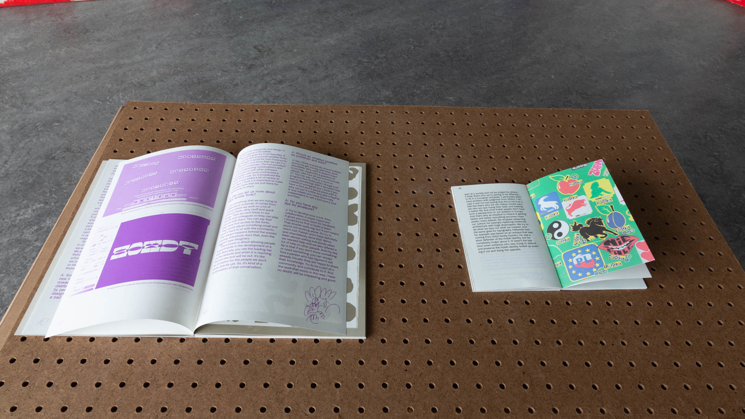
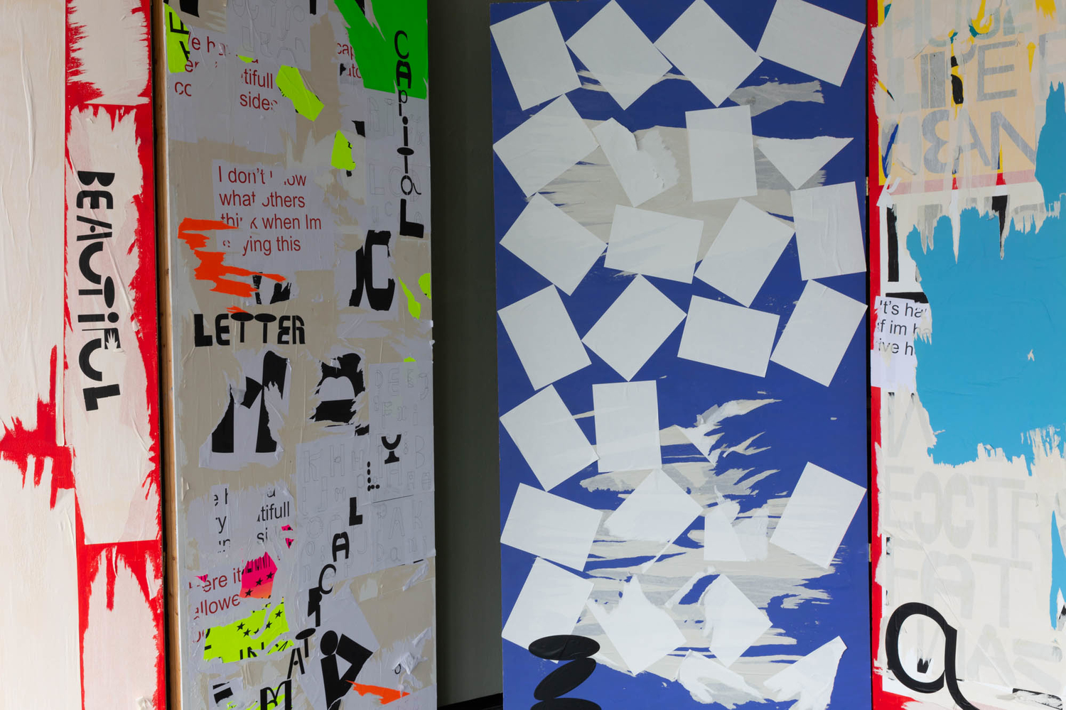
Polish graphic design is better known for illustrations than typography. When trying to collect information about one of the first type foundries in Poland I realised that there were no archives. This led me to make my own archive of letters made by Polish people, but who have not studied typography or type design. This archive is brought together in a font. During the process of gathering letterforms I started asking questions about national pride, specifically in relation to my home country of Poland. These questions led to a series of hand painted signs that serve as a type specimen for this font. Hand painted graphic billboards, made by amateurs, can be considered a part of Polish typographic tradition and with my work I echo a pride in this facet of Polish typo-graphic design.

