Frontpage(s)
Front-space, week 11 2023, Front-space, week 15 2022
Sujin Lee (Susu)
She/her
South Korea, 1996
susuitsme
Thesis: Out of (Sort)
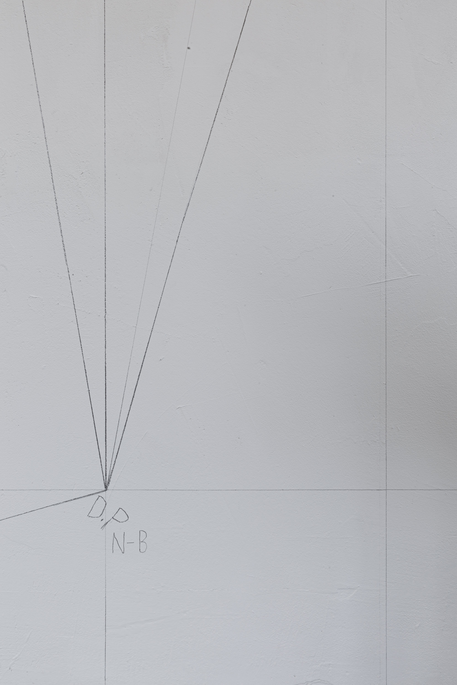
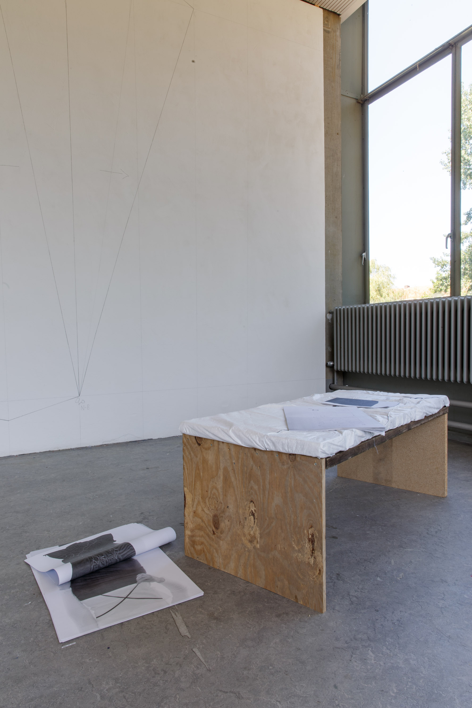
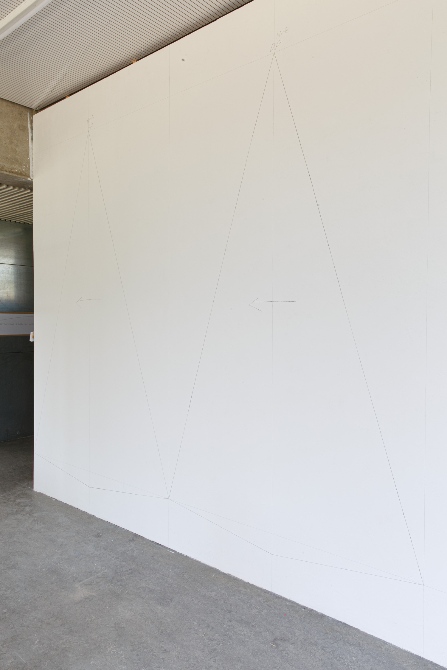
letters, type, writing, language, patchwork, sewing, æ, strip, cut out, drum, character simulated design, matrix, movable, wrong sorts, oral, distributing, straight, parallel, diagonal lines, research, capturing, reading, walking
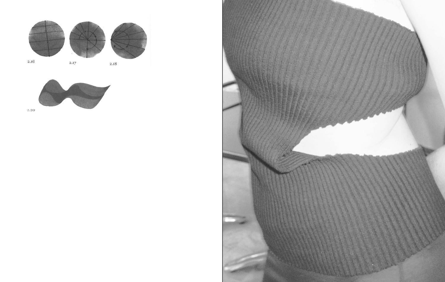
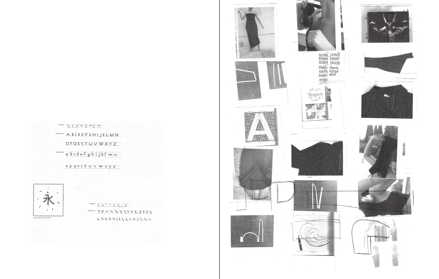
Before studying graphic design, while studying in fashion, typefaces and typography appeared to me as images.
At that time, to me, typography served as a subordinate element, meant to harmonize with fabrics, colours,
textures, and other design elements.
How can I draw the letter ‘S’ differently? Whenever I draw or design ‘S’, I experience Gestaltzerfall. There is a character similar to ‘S’ in the Korean alphabet. ‘予’ looks similar when you type it, but when you draw it is so different that it becomes hard to distinguish from one another.
When the professor from my first-year typography class at the Rietveld Academie asked me to draw the letter ‘a’ in serif and sans-serif I had no idea how to do it because I didn’t know the difference between the two.Recently, I read Publishing, publishing manifesto by Michalis Pichler; I suddenly became aware that I was not ‘reading’ the book. In fact, I did not read more than four pages; instead, I only focused on the typeface, flipping single pages again and again only to start reading properly after realizing this. What is it that made me want to re-read and turn the page?
Susu Lee, 2023